
Fetch Rewards
Usability Study
Fetch Rewards
Usability Study
Fetch Rewards
Usability Study
Fetch Rewards
Usability Study
Fetch Rewards
Usability Study
Fetch Rewards
Usability Study
Project overview
Project overview
Fetch Rewards is an online rewards platform that connects users with earning opportunities through receipt scanning, shopping, and partner offers.
It features an extensive selection of brands and retailers, enabling users to easily accumulate points and redeem rewards.
Fetch Rewards is an online rewards platform that connects users with earning opportunities through receipt scanning, shopping, and partner offers.
It features an extensive selection of brands and retailers, enabling users to easily accumulate points and redeem rewards.
Fetch Rewards is an online rewards platform that connects users with earning opportunities through receipt scanning, shopping, and partner offers.
It features an extensive selection of brands and retailers, enabling users to easily accumulate points and redeem rewards.
Duration
Duration
4 months
4 months
My Role
My Role
UX Designer · Researcher
UX Designer · Researcher
Fetch Rewards offered a chance to explore how everyday shopping, motivation, and digital rewards come together in a growing world of gamified experiences.
This study wasn’t just about smoothing out the app; it was about rethinking how we feel value, excitement, and reward in the small moments of our daily lives.
Research goals
Research goals
The goal was to see how easily users can complete key tasks and identify any usability issues affecting clarity or efficiency
The goal was to see how easily users can complete key tasks and identify any usability issues affecting clarity or efficiency
To understand whether users can smoothly complete the app’s core tasks and to identify usability issues affecting efficiency, comprehension, and satisfaction.
The study focuses on uncovering:
To understand whether users can smoothly complete the app’s core tasks and to identify usability issues affecting efficiency, comprehension, and satisfaction.
The study focuses on uncovering:

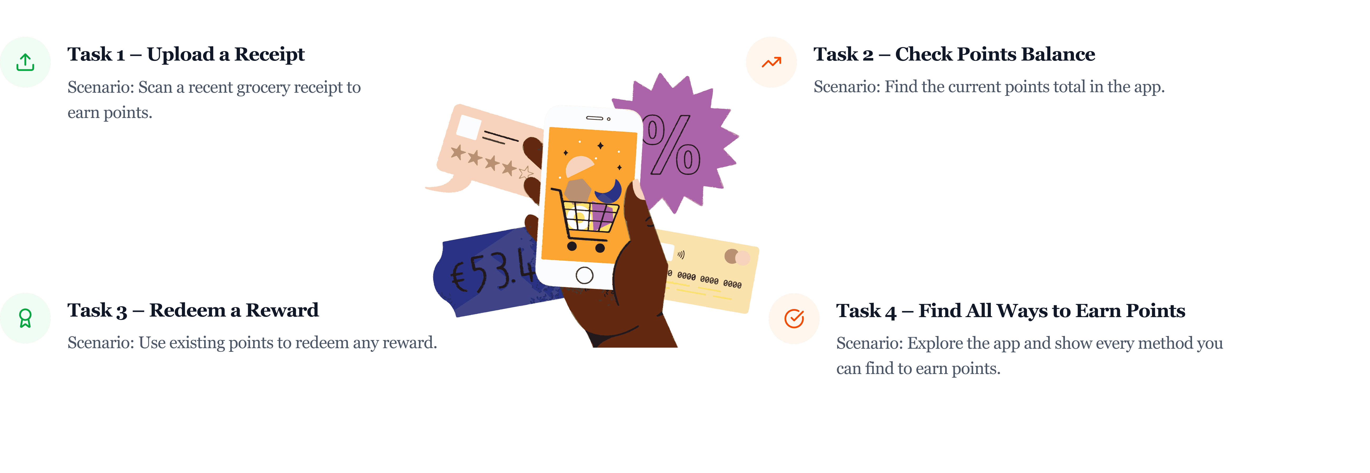
Tasks
Tasks
Four main tasks to see how easily users can complete key actions and where they may get stuck
Four main tasks to see how easily users can complete key actions and where they may get stuck
Based on the research goals above, I designed four tasks and also conducted metric-based evaluations to measure performance.
Based on the research goals above, I designed four tasks and also conducted metric-based evaluations to measure performance.
Before the actual test, I did two trial runs to check whether the tasks made sense and truly matched the research goals.
Before the actual test, I did two trial runs to check whether the tasks made sense and truly matched the research goals.
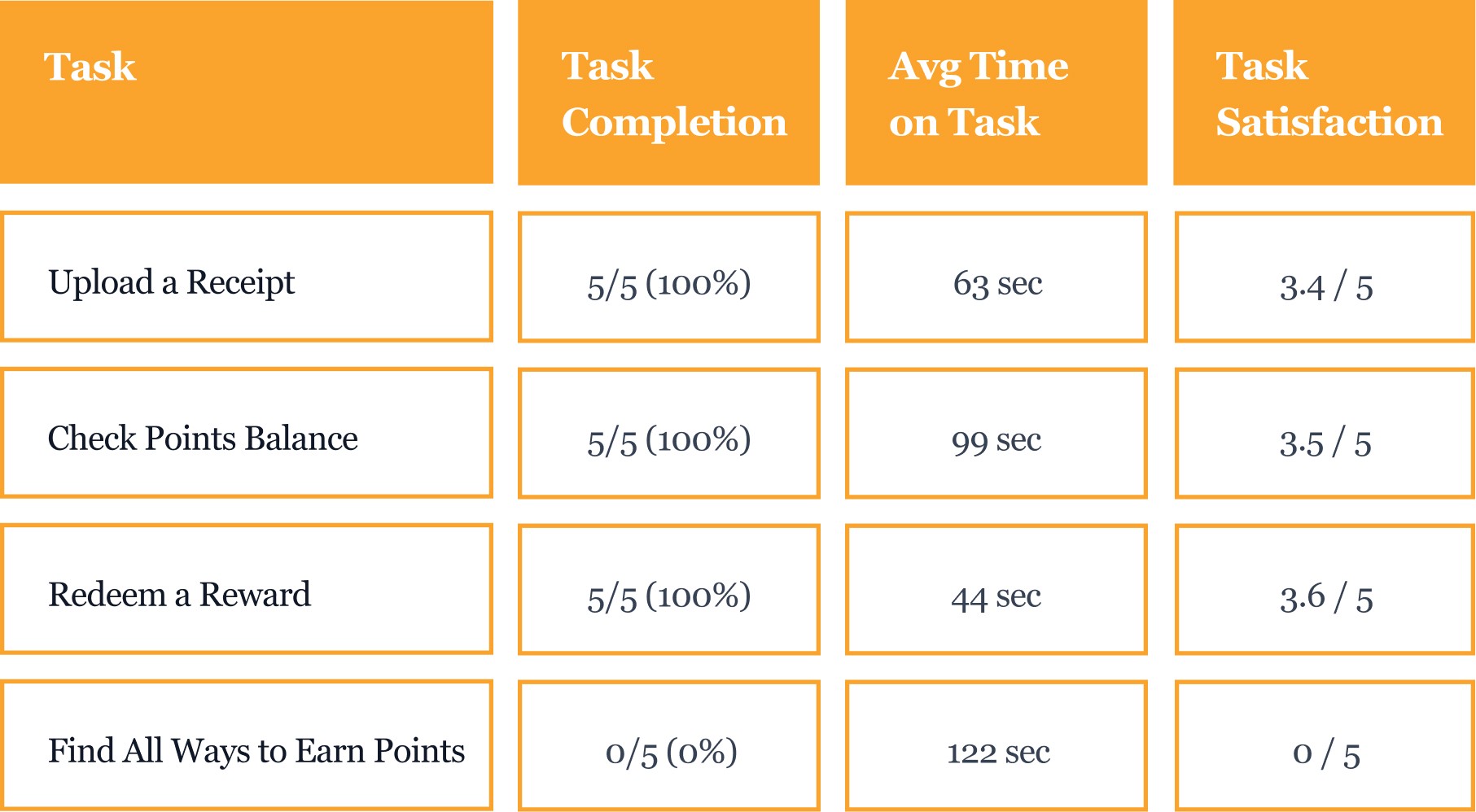
Metrics
Metrics

Observations and analysis
Observations and analysis
What stood out during testing and the insights it led to
What stood out during testing and the insights it led to
I conducted the study sessions both in person and through Zoom, depending on participant availability. Each session included screen and voice recording to make participation convenient while still collecting rich data on user interactions.
In measuring task completion during the study, a nuanced approach was adopted. This included considering partial completions, where tasks were accomplished to an extent but not fully due to system-related issues.
Alongside metrics, the think-aloud method and observational data were essential for revealing usability issues that were not immediately reflected in completion rates.
Even though most tasks were completed successfully, user behavior showed patterns of hesitation, confusion, and misplaced expectations, all of which informed the findings presented below.
Errors—unintended actions caused by misunderstanding or unclear interface signals—were also documented. These helped categorize findings into two groups: 'Issues' and 'Errors', representing both structural design problems and user misinterpretations.
Errors—unintended actions caused by misunderstanding or unclear interface signals—were also documented. These helped categorize findings into two groups: 'Issues' and 'Errors', representing both structural design problems and user misinterpretations.
Errors
Errors

Issues
Issues

Design implications
Design implications
What these findings mean for the design
What these findings mean for the design
After watching how users actually interacted with the app, I pulled out the moments where they got confused or stuck and turned those pain points into clear, practical design changes that could make the experience smoother and easier to understand.
After watching how users actually interacted with the app, I pulled out the moments where they got confused or stuck and turned those pain points into clear, practical design changes that could make the experience smoother and easier to understand.
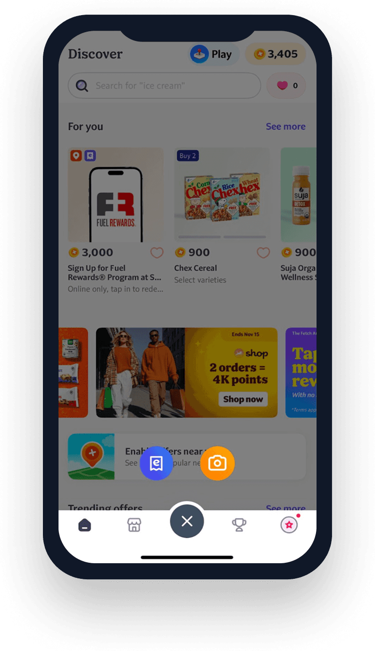
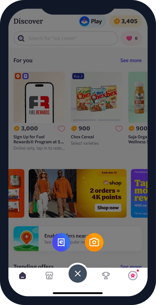
1.Users hesitate between multiple receipt upload options
1.Users hesitate between multiple receipt upload options
“Which one scans the paper receipt?”
“Is eReceipt the same thing?”
“Which one scans the paper receipt?”
“Is eReceipt the same thing?”
Design Implication
Design Implication
Clarify the functional difference between upload methods so users can choose the correct option without hesitation. Add helper text (e.g., “Use this to scan paper receipts”), visually emphasize the primary action, and reduce ambiguity between options.
Clarify the functional difference between upload methods so users can choose the correct option without hesitation. Add helper text (e.g., “Use this to scan paper receipts”), visually emphasize the primary action, and reduce ambiguity between options.
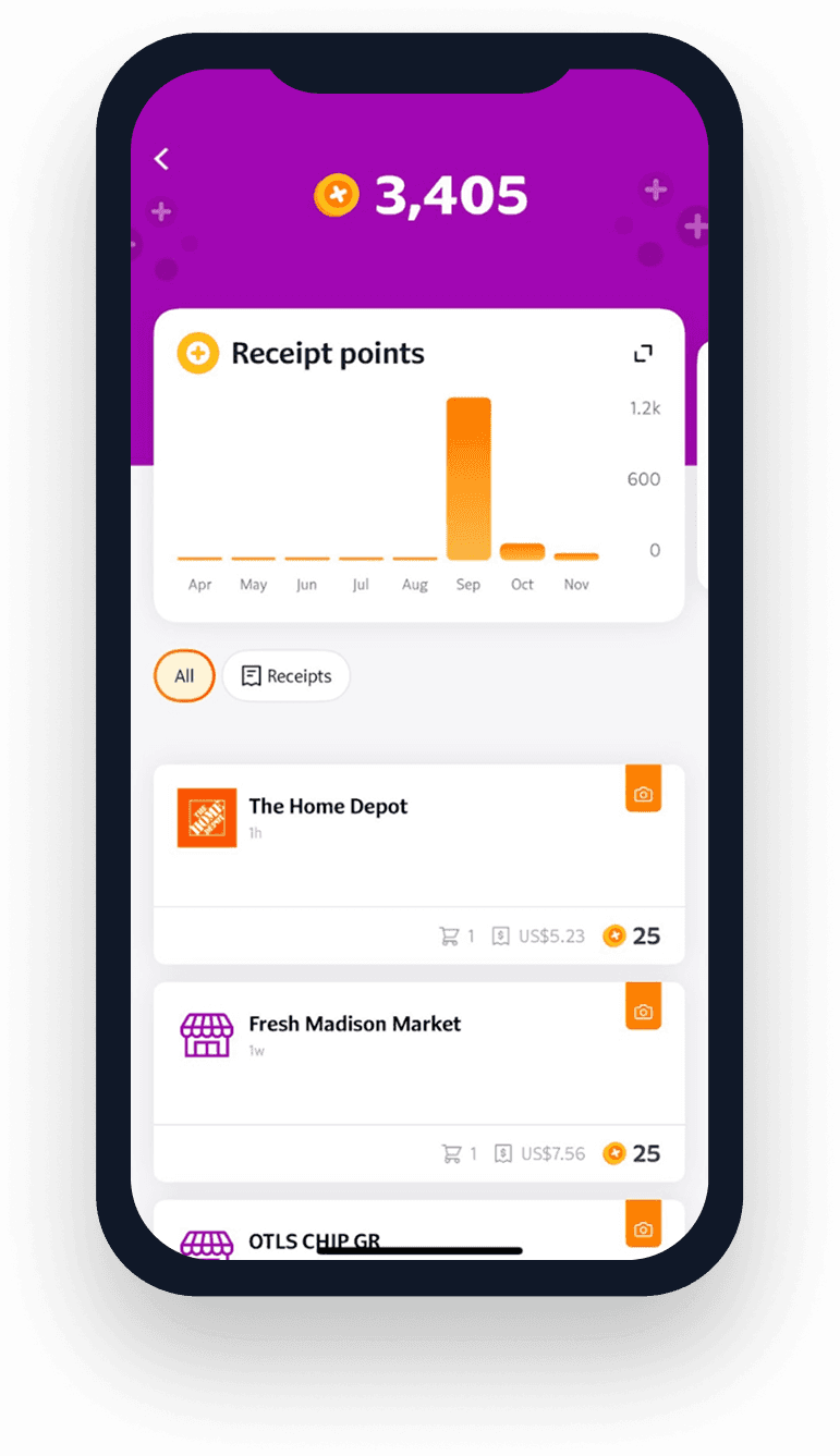
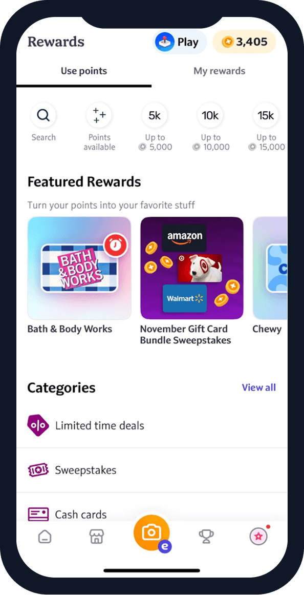
2.Points balance is hard to find
“I thought my points would be under Rewards.”
“I wish it has a dashboard for points.”
Design Implication
Make points visibility more prominent to improve clarity and reinforce motivation.
Elevate the placement of the points page or dashboard entry, add visual emphasis or iconography, and reduce reliance on hidden navigation.
3.Redemption feedback is too subtle
“Did it actually go through?”
“There’s no actual icon at the bottom to enter the rewards page.”
Design Implication
Provide clearer confirmation cues and strengthen access to the Rewards section.
Add checkmark animations, progress bars, or success screens; make the Rewards page entry more obvious.

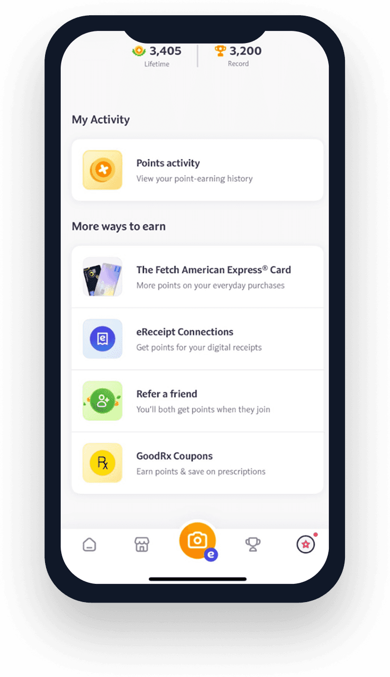
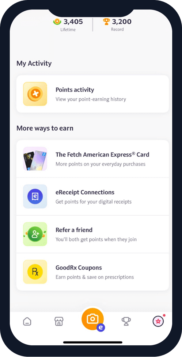
4.Users could not find all ways to earn points
“I don’t know how else you can earn points besides receipts.”
“Oh, I didn’t even notice this section before.”
Design Implication
Make all point-earning methods more visible through visual cues, onboarding, or contextual guidance. Highlight earning methods using tooltips, onboarding cards, visual badges, or cues in the Offers/Discover sections.
2.Points balance is hard to find
“I thought my points would be under Rewards.”
“I wish it has a dashboard for points.”
Design Implication
Make points visibility more prominent to improve clarity and reinforce motivation.
Elevate the placement of the points page or dashboard entry, add visual emphasis or iconography, and reduce reliance on hidden navigation.

3.Redemption feedback is too subtle
“Did it actually go through?”
“There’s no actual icon at the bottom to enter the rewards page.”
Design Implication
Provide clearer confirmation cues and strengthen access to the Rewards section.
Add checkmark animations, progress bars, or success screens; make the Rewards page entry more obvious.
4.Users could not find all ways to earn points
“I don’t know how else you can earn points besides receipts.”
“Oh, I didn’t even notice this section before.”
Design Implication
Make all point-earning methods more visible through visual cues, onboarding, or contextual guidance. Highlight earning methods using tooltips, onboarding cards, visual badges, or cues in the Offers/Discover sections.
Reflection
Reflection
Users may get lost, but good design can guide them back
Users may get lost, but good design can guide them back
Watching people use Fetch gave me a clearer sense of where the experience feels smooth and where it creates hesitation. Moments like choosing how to upload a receipt or figuring out where points are shown reminded me how much users rely on clear cues to feel confident.
I also realized that some earning methods are easy to miss, which means the app could highlight its value more directly. This study helped me think more carefully about how to guide users toward the actions that matter most.
© Yilin Chen 2026. Proudly hand created.
© Yilin Chen 2026. Proudly hand created.