
Designing a CAN Network Monitoring Dashboard for Automotive Engineers
Designing a CAN Network Monitoring Dashboard for Automotive Engineers
Designing a CAN Network Monitoring Dashboard for Automotive Engineers
Designing a CAN Network Monitoring Dashboard for Automotive Engineers
Project overview
Project overview
When I joined the project, an initial version of the dashboard already existed, but it lacked clear data visualization and intuitive information access.
As the designer on the team, I was responsible for translating complex requirements and ideas into a structured, user-centered product experience.
When I joined the project, an initial version of the dashboard already existed, but it lacked clear data visualization and intuitive information access.
As the designer on the team, I was responsible for translating complex requirements and ideas into a structured, user-centered product experience.
What is CAN data?
CAN (Controller Area Network) data consists of real-time signals transmitted between vehicle control units. These signals reflect system status and are used to detect faults during development and testing.
High-frequency updates
Multiple signal types and status flags
Critical for fault detection and system validation
Team
2 Back-end Engineers, 2 Front-end Engineers, 1 UX designer & PM, 5 Stakeholders
Duration
4 months
My Role
UX Designer · Researcher
Team
Team
2 Back-end Engineers
2 Front-end Engineers
1 UX designer & PM
5 Stakeholders
2 Back-end Engineers
2 Front-end Engineers
1 UX designer & PM
5 Stakeholders
Duration
Duration
4 months
4 months
My Role
My Role
UX Designer · Researcher · PM
UX Designer · Researcher · PM
Research
Research
Find answers in the noise
Find answers in the noise
I engaged with key stakeholders, including developers, test engineers, and product leads, to better understand the system context, workflows, and technical considerations.
The goal at this stage was to build a foundational understanding of how the dashboard was used and how it fit within the broader engineering environment.
Through interviews with developers, testers and project members, I uncovered key challenges:
Through interviews with developers, testers and project members, I uncovered key challenges:

To move forward, I worked closely with developers, test engineers to align on workflow expectations and signal hierarchy.This collaboration led to several key insights that defined the core components of the redesigned dashboard.
This alignment provided the framework for transforming the dashboard into a more intuitive decision-support system.

Ideation
Ideation
From flat signal tables to modular, role-aware layouts
From flat signal tables to modular, role-aware layouts
Based on the identified workflows and insights, I explored multiple layout structures and component groupings to better support role-specific tasks.
This phase focused on reorganizing information layers, redefining signal hierarchy, and testing how different dashboard configurations could improve clarity and interaction flow.

Design
Design
A Streamlined Design System and Reimagined Information Architecture
A Streamlined Design System and Reimagined Information Architecture
Initial wireframes highlighted the need for clearer signal prioritization, more distinct role-based views, and improved transitions between overview and detailed panels. Usability testing confirmed that while the structure reduced data overload, users still required stronger visual cues and simplified inspection flows.
Initial wireframes highlighted the need for clearer signal prioritization, more distinct role-based views, and improved transitions between overview and detailed panels. Usability testing confirmed that while the structure reduced data overload, users still required stronger visual cues and simplified inspection flows.
Through iterative adjustments and stakeholder feedback, the dashboard evolved into a layered system that balanced real-time visibility with focused analysis, making it more aligned with real-world engineering tasks.

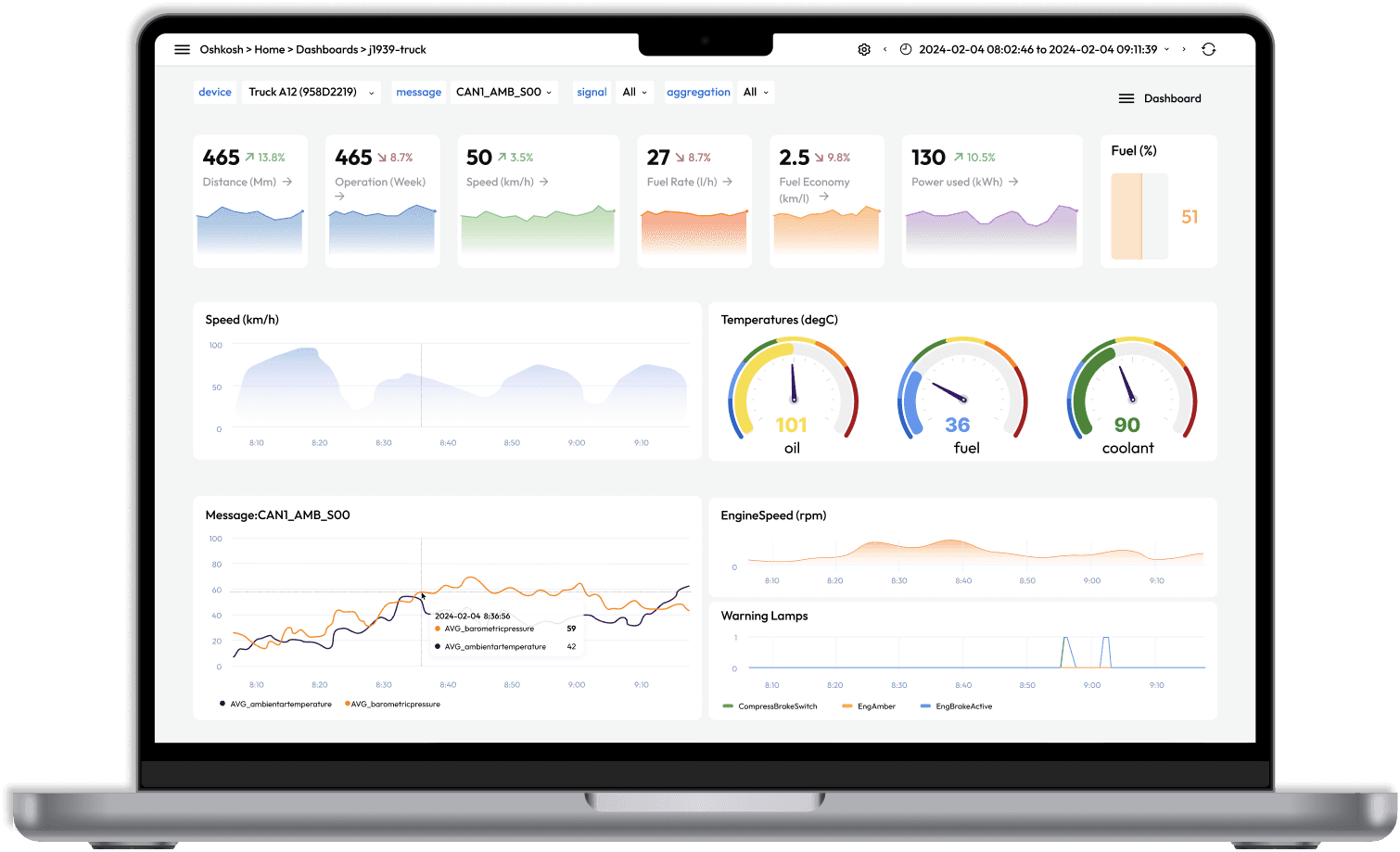
Final Design


Reflection
Reflection
Designing for Two Mindsets
Designing for Two Mindsets
Working on this project really showed me how important early research is — especially for something like a dashboard. You can’t just start designing pretty charts; you have to know what users actually need and what information really matters to them. Talking with developers and testers helped me see those differences clearly and design around their priorities.
This capstone course also helped me grow a lot in how I present ideas and work with a team — learning to explain my design choices, listen to feedback, and build something together that truly works for its users.

© Yilin Chen 2026. Proudly hand created.
© Yilin Chen 2026. Proudly hand created.
Redesigning for Trust
An Energy Website Revamp That Converts